Composition
The complete guide to photo composition grids
Every composition grid worth knowing — what it does, when it works, when it doesn't, and how to choose between them. Eleven grids, in order of usefulness.
A composition grid is a set of lines you put over the viewfinder to help you decide where things go. That's the whole job. Every grid is doing it differently, and most camera apps ship two of them — rule of thirds and a centered cross — and call it a day.
There are at least eleven grids worth knowing. Some are foundational. Some are situational. Some are mostly marketing. This is what each one does and when to reach for it, ranked roughly in order of how often I use them.
If you've read the other posts in this series, you'll recognize most of these. This one is the reference: the page to bookmark when you can't remember whether the phi grid sits at 38% or 33%.
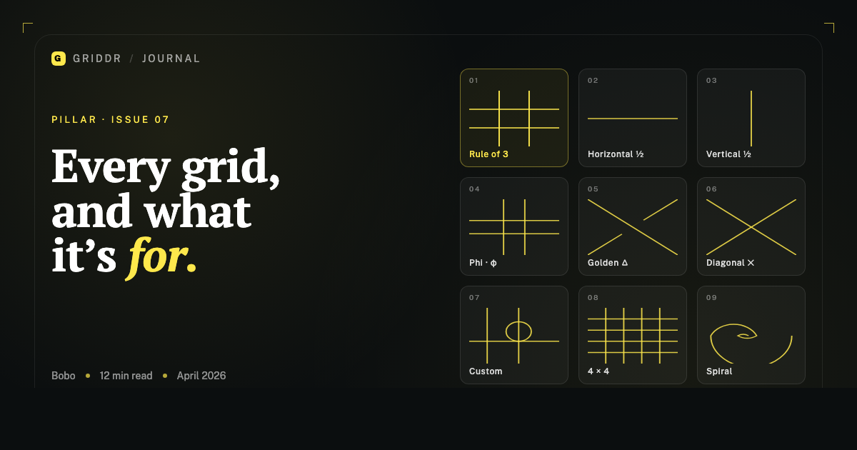
1. Rule of thirds
What it is. Two horizontal and two vertical lines, dividing the frame into nine equal rectangles. Subjects go on the lines or at the four intersections.
When to use it. Default. The first grid you should learn and the last one you should abandon. Works for landscapes (horizon on the upper or lower third), single-subject portraits (eyes on the upper third, body on a vertical third), street photography, product photography, and any photo that isn't deliberately symmetric.
When it doesn't work. Symmetric photos (center them). Photos with strong diagonal motion (use the golden triangle). Tightly cropped detail shots where there's no real "third" because the subject fills the frame.
Why it works. The eye reads horizontal and vertical lines as stable. A subject on a third sits comfortably without competing with the grid. The lines disappear, the subject stays.
2. Horizontal half (single line)
What it is. One horizontal line cutting the frame in half.
When to use it. Any time you have a horizon. Beach. Landscape. City skyline. Architecture with a horizontal element. Anything where a horizontal line in the photo can be tilted by accident.
Why it's underrated. It's the simplest grid you can use, and it fixes the single most common mistake — tilted horizons. The reason it beats rule of thirds for this specific job: rule of thirds gives you two horizontal lines, neither of which is necessarily where your horizon is. The half-grid sits at the middle, which is usually closer to where the horizon ends up.
3. Vertical half (single line)
What it is. One vertical line cutting the frame in half.
When to use it. Symmetric portraits, doorways, mirrors, reflections, hallway shots. Anything where the photo's whole point is symmetry around a central axis.
When it doesn't work. Anything that isn't symmetric. The vertical half grid is one of those grids that's only ever right or completely wrong — there's no in-between use case.
4. Phi grid (golden ratio)
What it is. Like rule of thirds, but the lines fall at 38.2% and 61.8% of the frame instead of 33.3% and 66.7%.
When to use it. Portraits and still life that want to feel slightly less designed than the rule of thirds. The intersections are closer to the center, which gives the photo a quieter, more classical feel.
When it doesn't work. Landscapes (rule of thirds gives you more breathing room). Street photography (the difference is too subtle to matter when you're shooting fast). Architecture (the rule of thirds matches building geometry better).
The honest take. It's the rule of thirds, slightly more elegant. Most people won't see the difference; the people who do are the ones who find it.
Full take on the golden ratio.
5. Golden triangle
What it is. A diagonal line from one corner of the frame to the opposite corner, plus two shorter lines from the other two corners that meet the diagonal at right angles. The frame is divided into four triangular regions.
When to use it. Diagonal motion (skateboarder mid-trick, surfer angled into a wave). Diagonal lines in the scene (a road receding, a staircase, a fence cutting across). Tension between two subjects placed on opposite sides of the diagonal.
When it doesn't work. Calm scenes. Landscapes with a horizontal horizon. Anything you want to feel stable.
Why it works. Diagonals are visually loud. The grid reinforces the diagonal already in the scene, and the eye reads the alignment as intentional.
How to choose between this and rule of thirds.
6. Diagonal cross
What it is. Two lines from corner to corner, forming an X across the frame.
When to use it. Symmetric diagonal compositions. A subject at the dead center of the X has the most visual weight a single point in a photo can have. Use it when you want the subject to feel placed, not just included.
When it doesn't work. Almost everything else. The diagonal cross is a dramatic grid for dramatic photos. It's not a default.
7. Custom grid (the one you made yourself)
What it is. Any combination of lines, circles, ovals, or shapes you draw yourself in the camera's grid editor.
When to use it. Repeating shoots that need consistency (product photography, before-and-afters, portraits in a series). Specialized situations (artwork, architecture, scientific documentation). Any time the built-in grids don't cover what you actually need.
Why it's the highest-leverage grid. A custom grid is the only one designed for your shoot. The 30 seconds it takes to build pays back across hundreds of photos.
How to build them. How to use them across a series.
8. 4×4 rectilinear grid (custom)
What it is. A custom grid with four vertical and four horizontal lines, evenly spaced at 20%, 40%, 60%, 80%.
When to use it. Photographing flat artwork, paintings, prints, documents. Architecture where you need precise alignment. Anything where the subject is rectangular and needs to be square in the frame.
Why it's not in the default set. Most cameras don't ship it because it's not useful for general photography. For the people who need it, no other grid will substitute.
9. Center cross (custom)
What it is. One horizontal and one vertical line, both at 50% of the frame, crossing in the dead center.
When to use it. Centering the focal point of a symmetric composition. Documentation shots where the subject must be in the exact middle of the frame.
Why it's worth building. The center cross is the simplest centering grid that doesn't ship in most cameras. You can layer it onto the 4×4 grid for both alignment and centering simultaneously.
How to layer them for paintings.
10. Fibonacci spiral
What it is. A logarithmic spiral curving from one corner of the frame, unwinding through approximately phi-grid intersections.
When to use it. Almost never, live. The spiral has direction and a starting corner — matching both to a real-time scene is harder than any other grid on this list.
When it works. As a diagnostic in review. Looking at a photo you took, the spiral can help you see why the composition is working — usually because there's a curve in the scene unwinding from a phi intersection.
The honest take. The spiral is more useful for analyzing other photographers' work than for taking your own. Treat it as a tool for studying composition, not for live shooting.
11. Frame within a frame (Pro)
What it is. A grid that overlays a smaller rectangle in the center of the frame, suggesting a place to compose a "frame within the frame" — a doorway, a window, an arch.
When to use it. When you're shooting through something. A tunnel of trees in a forest. A doorway with a person beyond it. A window onto a street scene. The grid prompts you to position the framing element so the inner rectangle aligns with the photo's actual subject.
When it doesn't work. Subjects that aren't framed by anything in the scene. Open landscapes. Plain backgrounds. Anywhere the photo isn't built around a compositional frame, this grid is in the way.
How to choose
Three questions, fast:
- Is the subject a horizon? Use the horizontal half.
- Does the photo have a strong diagonal — line, motion, gaze? Use the golden triangle.
- Is everything else? Use rule of thirds.
That's 90% of the choices you'll ever make. The remaining 10% — phi for elegant portraits, diagonals for dramatic scenes, frame-within for tunnels and doorways, custom for repeating shoots — are the situations where you've already noticed the default isn't working. The grid menu is your second-pass tool, not your first.
Most photos want rule of thirds. The interesting photos want something else.
What grids don't fix
Grids are alignment and placement. They don't fix:
- Light. A badly lit subject on a perfect grid is still badly lit.
- Focus. A blurry photo with the right composition is a blurry photo.
- Distance. If you're too close or too far for the subject, no grid choice will save it.
- Subject choice. A boring subject doesn't get more interesting on a third.
Composition is one layer of a photograph. The grid is one tool inside that layer. Treat it as the tool that turns "I think the framing is okay" into "I know the framing is right" — that's the gap it closes, and it's a real gap, but it's not the whole job.
After enough time with these, you'll stop reaching for the menu and start composing first, picking the grid second to confirm what you already saw. That's when the grids have done their job — when you don't need them anymore. But until then, having the right one a tap away is the difference between intentional photographs and lucky ones.
Related reading
- Custom camera grids: design your own overlay
- Rule of thirds: 12 real examples from your phone
- Rule of thirds vs. golden triangle
- Golden ratio in phone photography
- Level every horizon
- Photograph artwork straight: the 4×4 grid method
- How to photograph paintings perfectly centered
- Match composition across a photo series with saved grids
- 5 composition mistakes every phone photographer makes
Shoot this with Griddr
Get Griddr — free on iOS & Android

