Artwork Photography
How to photograph paintings perfectly centered
A specific method for shooting framed paintings square, centered, color-true, and ready for print or insurance — using only a phone, a wall, and one custom grid.
There's a class of photo most camera apps quietly fail at: the documentation shot of a framed painting. The job is to make the painting look exactly like itself, on a flat plane, in true color, perfectly centered. No flair. No mood. Just a clean rectangle of the artwork.
If you've tried it with the default camera, you know what happens. The frame is straight-ish. The painting is centered-ish. The whites lean cream and the reds lean pink. The print shop, the gallery, or the insurance adjuster will all push back.
This is the method I use. It takes three minutes per painting once the setup is right.
The grid you actually need
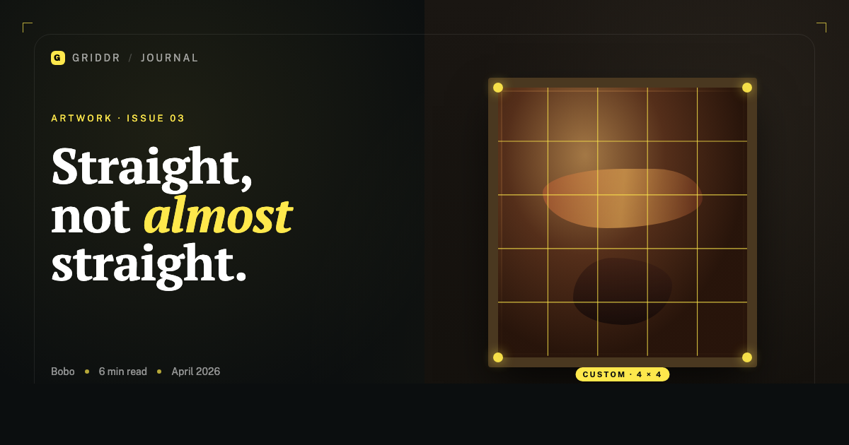
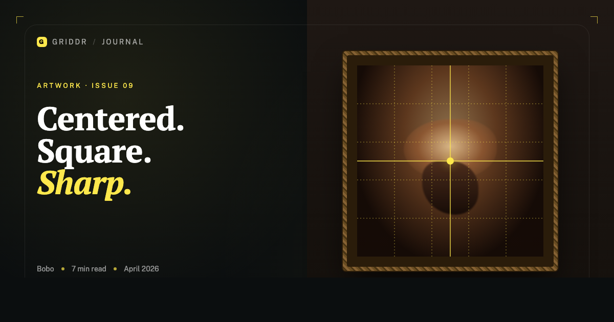
The 4×4 grid I wrote about in another post is the alignment grid. For centering specifically, you want one more line.
Build a custom grid in Griddr with:
- Four vertical lines at 20%, 40%, 60%, 80%
- Four horizontal lines at the same percentages
- Plus a center cross — one vertical at 50%, one horizontal at 50%
Save it as Painting — center & align. The 50% cross is the part that does the centering work; the 4×4 outer lines verify the painting is square.
If the painting has a strong central focal point — a face in a portrait, the center of a mandala, the apex of a triangular composition — that focal point should land on the center cross. If it doesn't, you're not centered yet. Move.
Distance and lens choice
Your phone has multiple lenses. Most have an ultra-wide (~13mm equivalent), a wide (~24mm), and sometimes a telephoto (~50mm or longer). For artwork, never use the ultra-wide. It introduces barrel distortion that bows the edges of a rectangle. The painting won't be a rectangle anymore.
Use the standard wide lens (the 1×) at minimum. If your phone has a telephoto, use that — it has the least distortion and the most accurate proportions.
For distance: the rule of thumb is at least 2× the painting's longest side away. A 1m painting? Stand 2m back. A small 30cm piece? 60cm minimum. Closer than that and the wide lens does its bowing thing and the painting looks like it's wrapped around a cylinder.
If your room isn't big enough to get back, the painting is bigger than your room is photographable. Take it outside or to a larger wall.
The wide lens lies. The telephoto tells the truth.
Height and angle
Your phone's lens needs to be at the vertical center of the painting, not at your eye level.
A painting hung at average gallery height (~1.5m to its center) will be below your standing eye line. If you shoot at your eye level, the camera looks down at the painting and keystones it — top edge wider than bottom edge.
Squat. Or use a tripod and adjust. Get the lens to where the center of the painting is.
For horizontal angle: stand directly in front, perpendicular to the wall. The 4×4 grid is your check — the painting's vertical edges should be parallel to your grid's vertical lines, not converging or diverging. If they converge, you're off to one side; rotate yourself, not the camera.
Light, and why it ruins your color
Indoor lights are not white. Tungsten is orange. Warm LEDs are pink-yellow. Fluorescent is green. Cool LEDs are blue. Your phone tries to compensate via auto white balance, but the auto correction is generic and rarely matches the actual painting.
Two practical fixes that take 30 seconds:
-
Shoot in indirect daylight. A north-facing window between 10am and 2pm gives the most neutral light a phone can see. Pull the painting to a wall near that window. Don't put it in direct sun, especially if the painting is varnished or under glass — you'll get glare.
-
Include a white card in your first shot. A piece of plain printer paper or a proper grey card, leaned against the painting's frame. Shoot the first frame with it visible. Then remove it and shoot the real frame. In editing, use the first frame to white-balance the second.
If you skip the card and trust the auto white balance, your reds will lean orange under tungsten and your whites will lean cream. For a painting where color matters — which is every painting — that's the difference between a usable photo and a discarded one.
The shot itself
With everything set up:
- Activate the
Painting — center & aligngrid. - Frame the painting so its outer edges fall on the grid's outer lines (the 20% and 80% lines on each axis).
- Verify the central focal point — or geometric center — lands on the center cross.
- Verify the painting's vertical edges are parallel to the grid's vertical lines (not keystoning).
- Tap the focus point on the painting itself, not the wall around it. Lock exposure.
- Hold the phone with both hands, exhale, shoot.
If you're shooting handheld, take three frames. The middle one is usually the sharpest. If you have a tripod or a phone stand, one frame is enough.
What you do in editing
For a documentation shot, edit minimally:
- White balance using the white-card frame.
- Crop to the painting's exact edges using the 4×4 grid as a guide. The corners should land on grid intersections.
- Check the vertical and horizontal edges are perfectly parallel to the crop frame; if not, use the geometry tool (Photos → Crop → Straighten, or Lightroom's Transform → Auto/Vertical) to square it.
- Don't add contrast, don't bump saturation, don't run a filter. The point is to make the photo match the painting, not improve it.
If you're shooting for editorial use — context shots in a gallery, on a sofa — break all of these rules deliberately. But for documentation, restraint wins.
This is the kind of photo where every detail you skip will show up later. The viewer won't know why the photo looks slightly off — they'll just know that it does. Following the method exactly is the difference between an okay reproduction and one that does the painting justice.
Related reading
Shoot this with Griddr
Get Griddr — free on iOS & Android